Original research · Accessibility · WCAG · Academic paper · In progress
Beyond Luminance
Research into where WCAG colour contrast requirements fail in practice, not because the maths is wrong, but because the standard was built on assumptions about perception that real-world design routinely violates.
- Vanilla JS
- HTML Canvas
- Vite
- Vercel
Context
WCAG 2.x defines colour contrast in terms of relative luminance: a ratio of the brightness of foreground to background. A ratio of 4.5:1 passes for normal text; 3:1 for large text. Most accessibility audits test this ratio and stop there. The assumption is that if the luminance ratio passes, the text is readable.
The problem
That assumption is wrong in a significant number of real-world cases. The standard was developed primarily with achromatic (grey-scale) perception in mind, and it does not account for several factors that are known to affect readability: chromatic contrast, simultaneous contrast effects, hue saturation, and the specific failure modes of colour vision deficiencies. Colour combinations that pass the luminance ratio can be perceptually unreadable; combinations that fail it can read clearly.
The approach
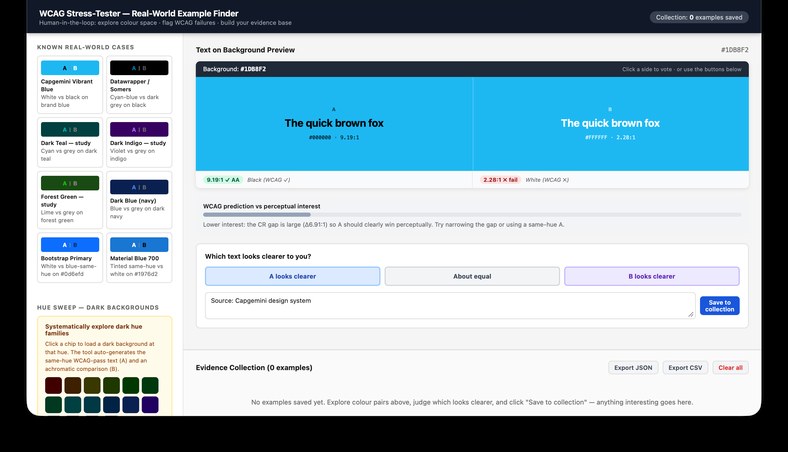
The work is grounded in a purpose-built stress-testing tool: the WCAG Stress-Tester. The tool generates and presents colour combinations at the edges of WCAG compliance, combinations that pass the ratio but might fail perceptually, and combinations that fail the ratio but might read clearly. Visitors judge which text looks clearer to them, and vote. The data from those judgements builds an evidence base of real-world perceptual failures and non-failures in the WCAG model.
The outcome
That evidence base forms the empirical foundation for an academic paper, currently in preparation. The paper will argue for an extension to the WCAG contrast model that accounts for the perceptual factors the luminance ratio cannot capture.